L'hem Pastry
L'hem Pastry is an Ethiopian brand creating clean, fresh sweets using traditional methods. It reflects artisanal craftsmanship with a modern touch, helping the brand stand out boldly.
Category
Premium Bakery Brand
Duration
4 weeks
Year
2025

The Problem
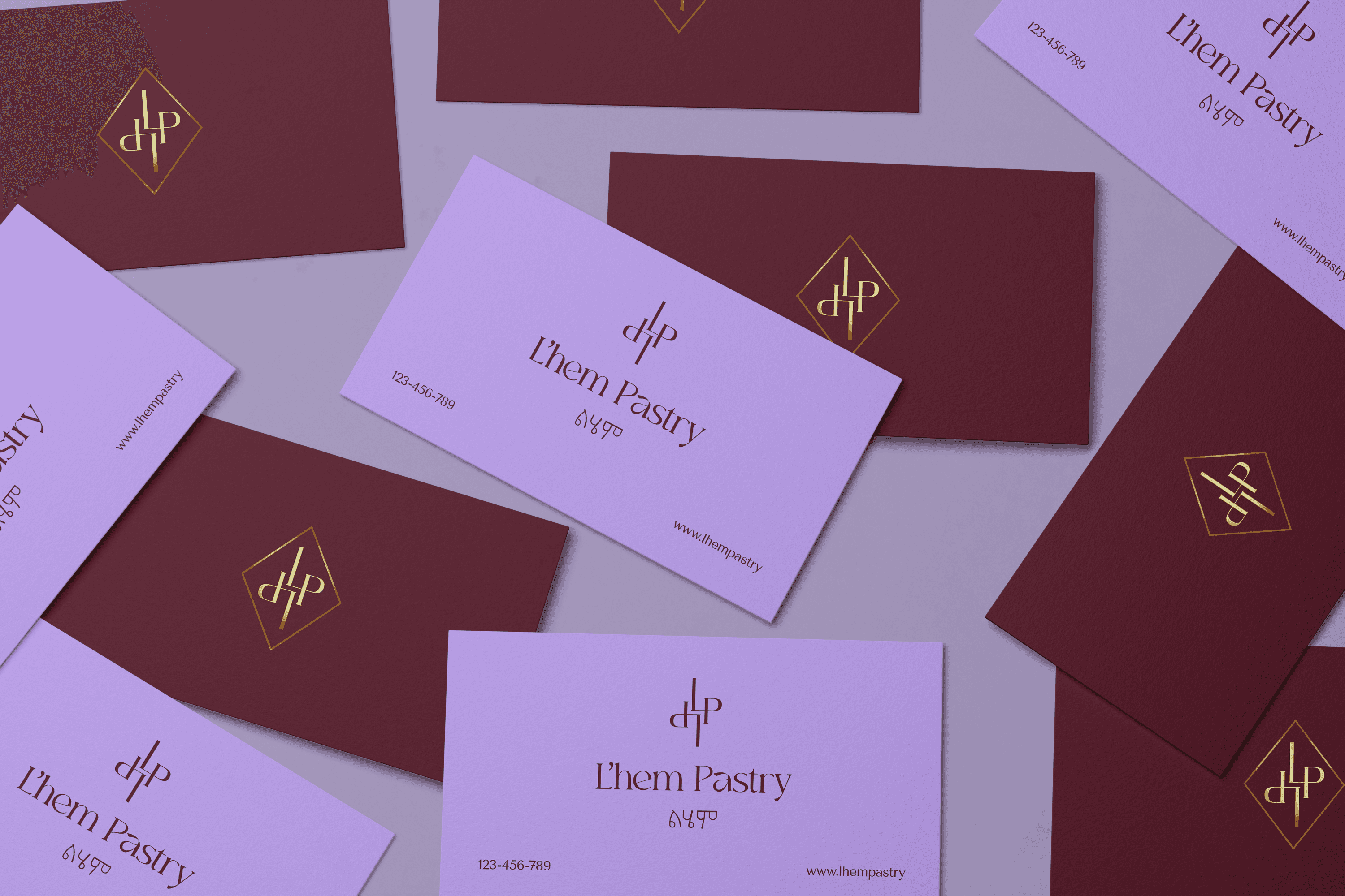
L'hem is derived from a Hebrew word meaning “bread.” The brand needed a minimal yet bold visual identity, avoiding the common white and dull aesthetic. The logo had to combine the name L'hem in both English and Hebrew, along with a simple icon that feels light when used together. At the same time, it was important to preserve the sweet & inviting nature of the brand.
Our Approach
Brand design · Visual Identity · Social media templates · Packaging
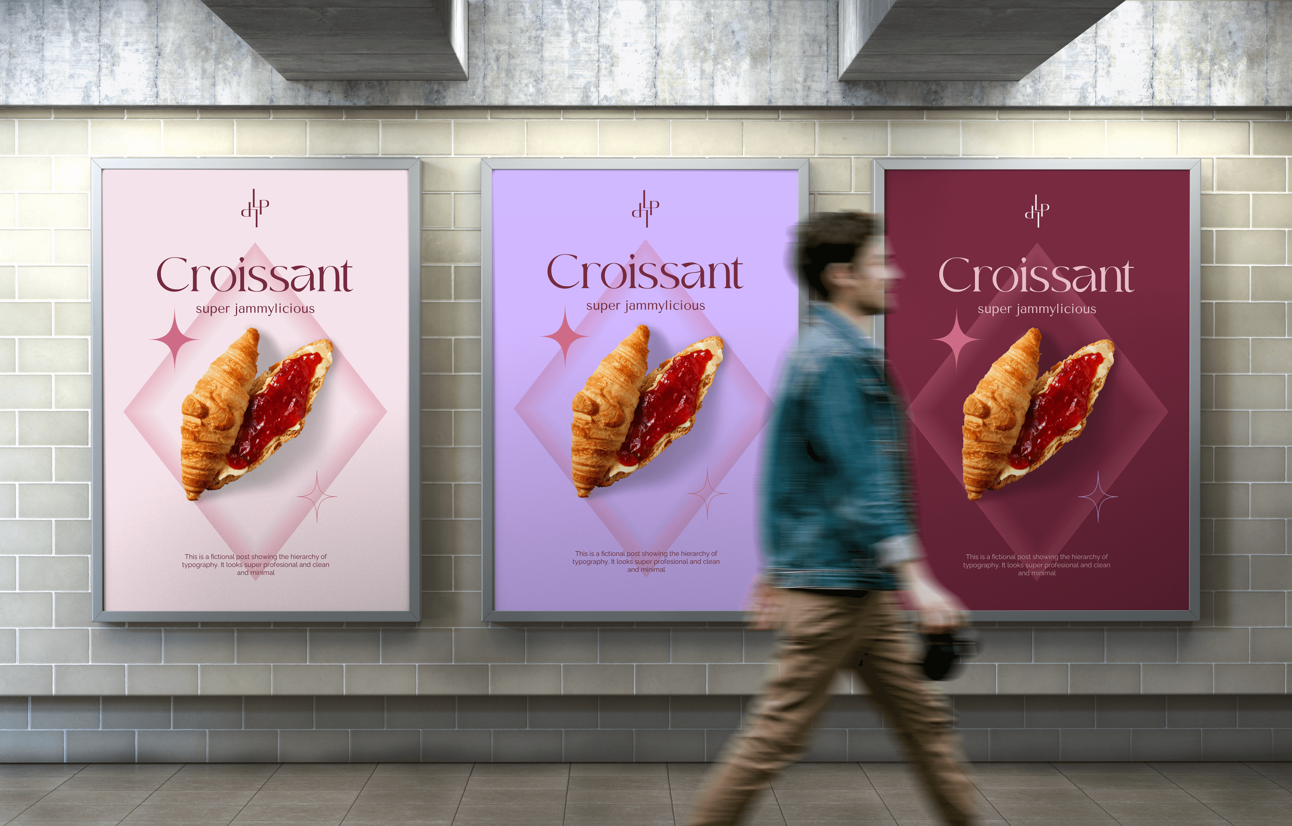
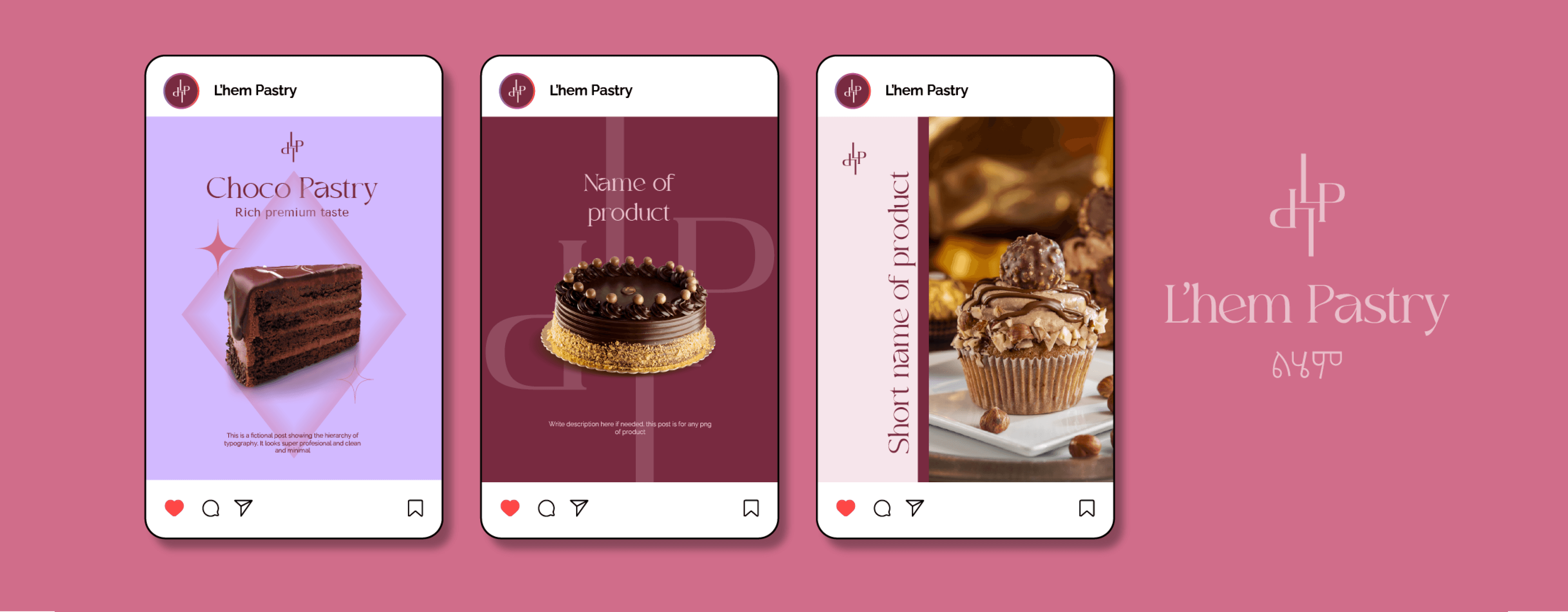
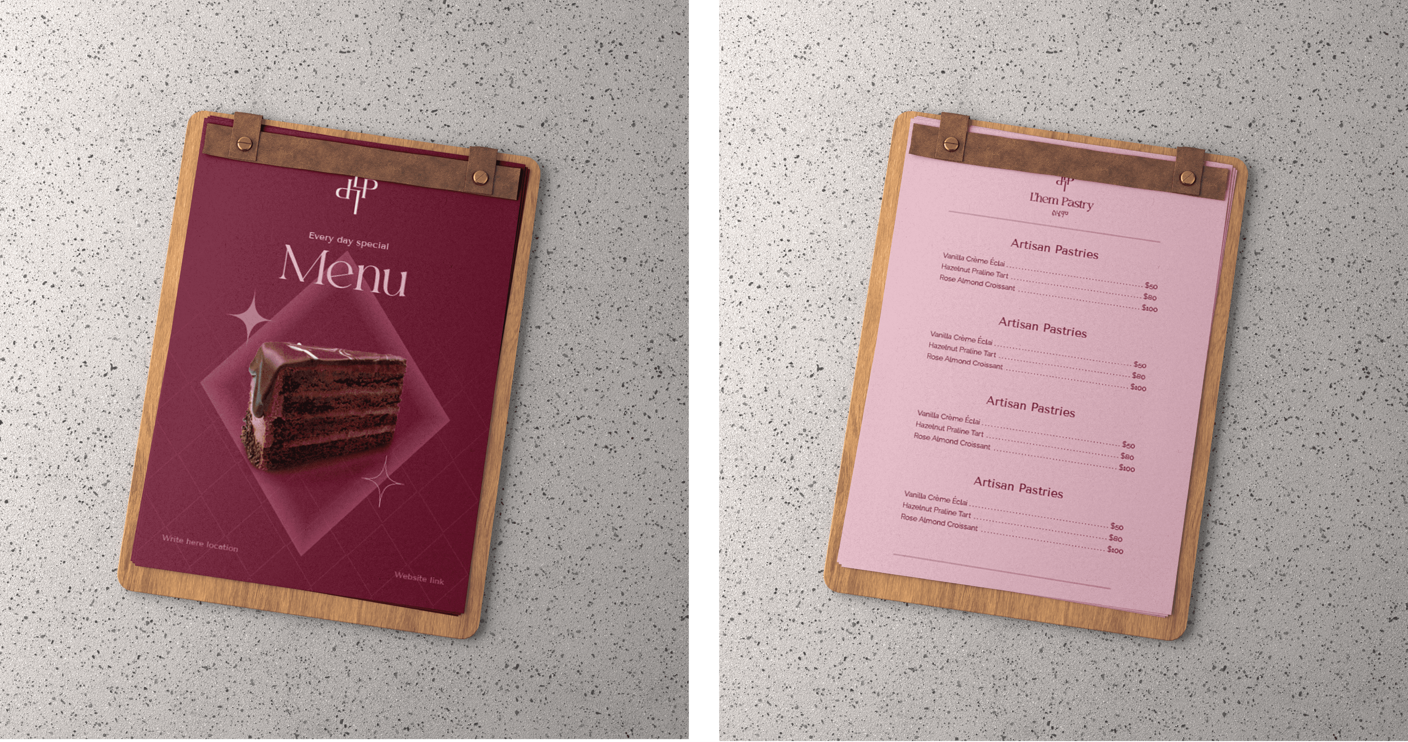
We introduced a wordmark that feels refined yet modern, striking a balance between tradition and freshness. The Hebrew lettering was hand-sketched and carefully refined to match the English wordmark, creating a strong sense of consistency across languages.
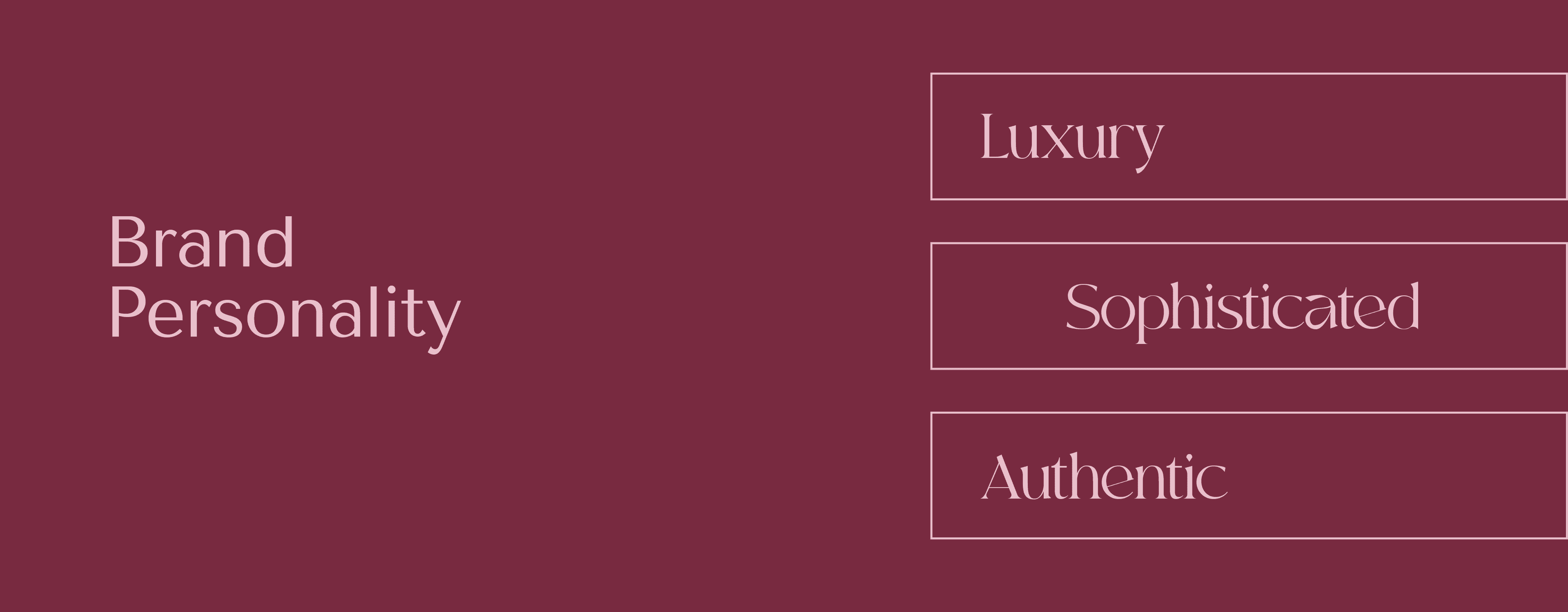
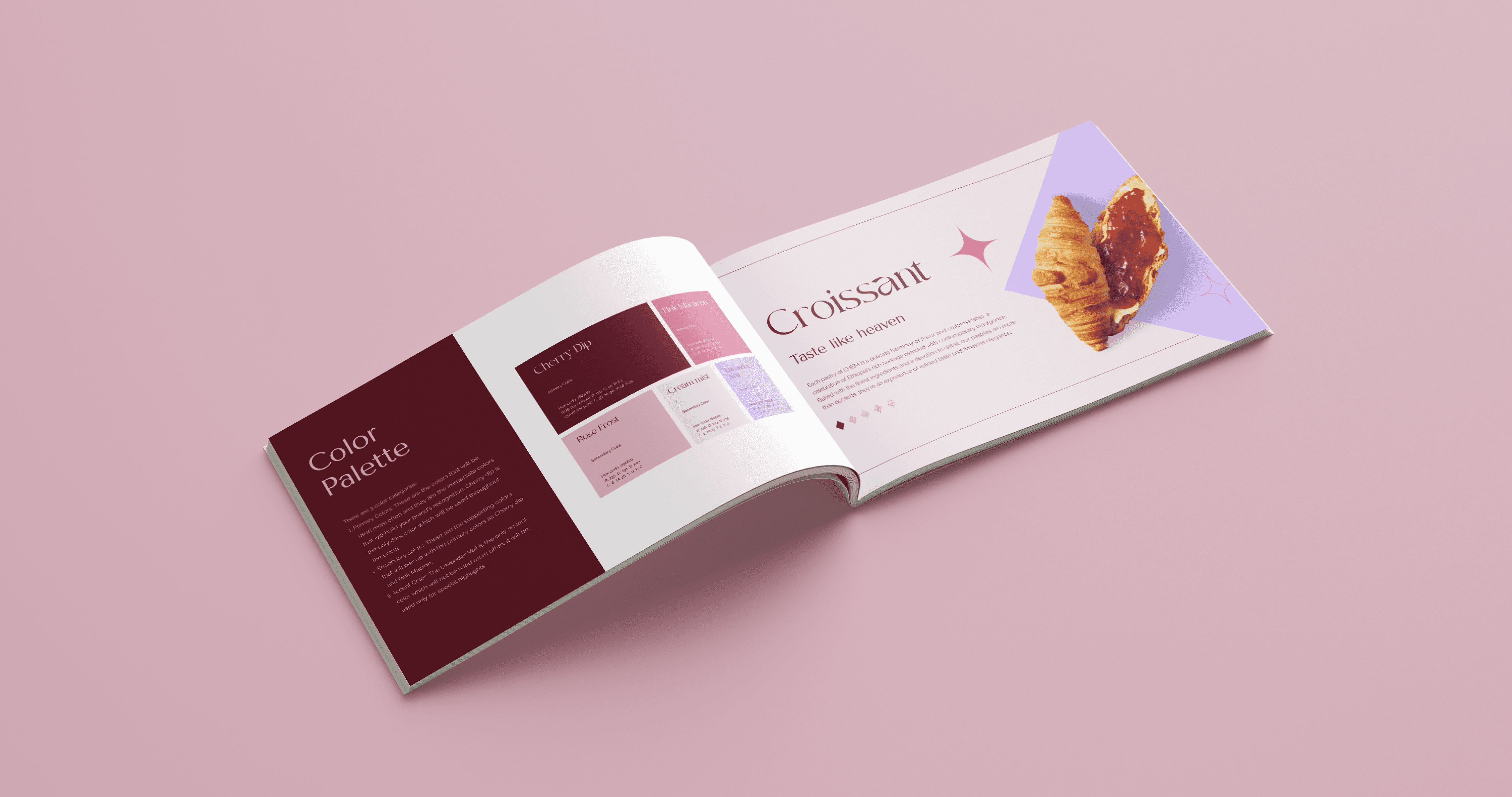
Since the pastry industry often relies on brown tones and soft palettes, we developed a colour system that feels bold yet still sweet and inviting. This approach helps L'hem stand out while staying true to its artisanal roots.
For packaging, the focus was on clean layouts, clear hierarchy, and subtle details that let the product feel premium without being heavy. The system is flexible across boxes, wraps, and labels, ensuring the brand looks consistent at every touchpoint.
Outcome
L'hem Pastry now feels a premium brand that confidently blends tradition with freshness. The bold yet sweet visual system helps it stand out in a crowded pastry market while staying warm and inviting. The brand is ready to shine in this competitive niche.