Pace+
Pace+ is an athlete-focused skincare brand designed to match the intensity of movement and recovery. With bold visuals, active layouts, and a high-contrast aesthetic, the identity channels strength, speed, and resilience—built to energize both the product and the person using it.
Pace+
Pace+ is an athlete-focused skincare brand designed to match the intensity of movement and recovery. With bold visuals, active layouts, and a high-contrast aesthetic, the identity channels strength, speed, and resilience—built to energize both the product and the person using it.
Category
Visual Identity
Duration
1 week
Year
2025
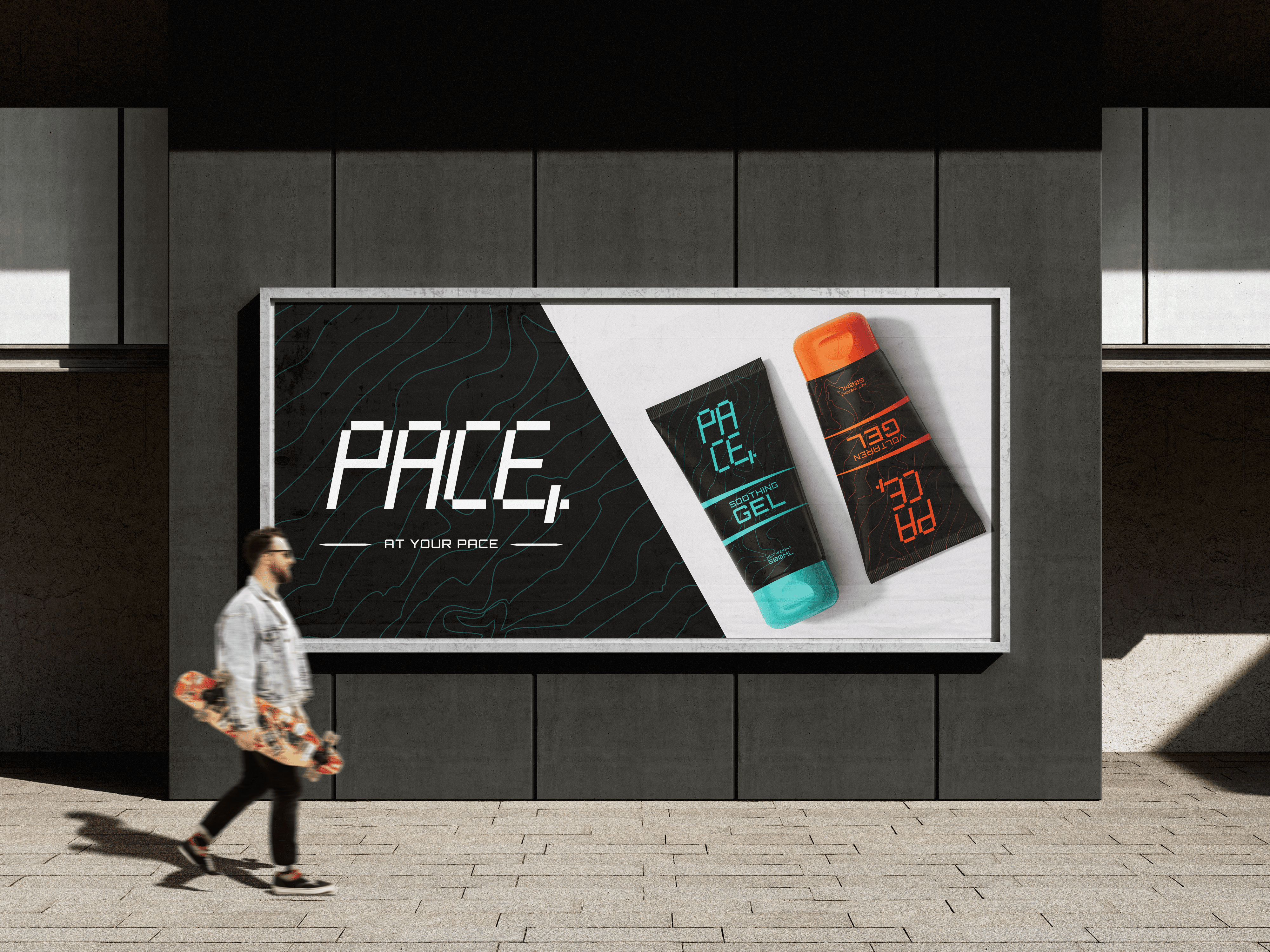
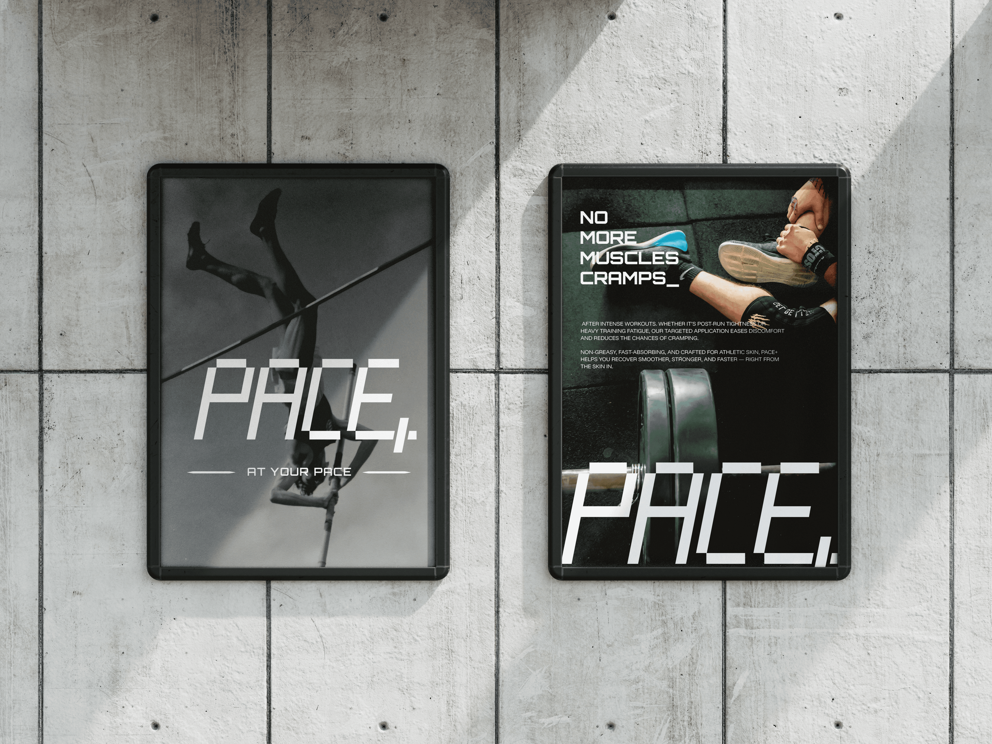
Built for movement, made to perform
Pace+ is more than just a skincare brand—it’s a reflection of athletic grit, recovery, and momentum. Every detail, from the custom typography to the energetic visuals, is designed to capture the rhythm of performance. With a bold, high-contrast identity, it channels strength and speed in a way that feels modern, intentional, and built for those who push limits.
What Makes It Impactful
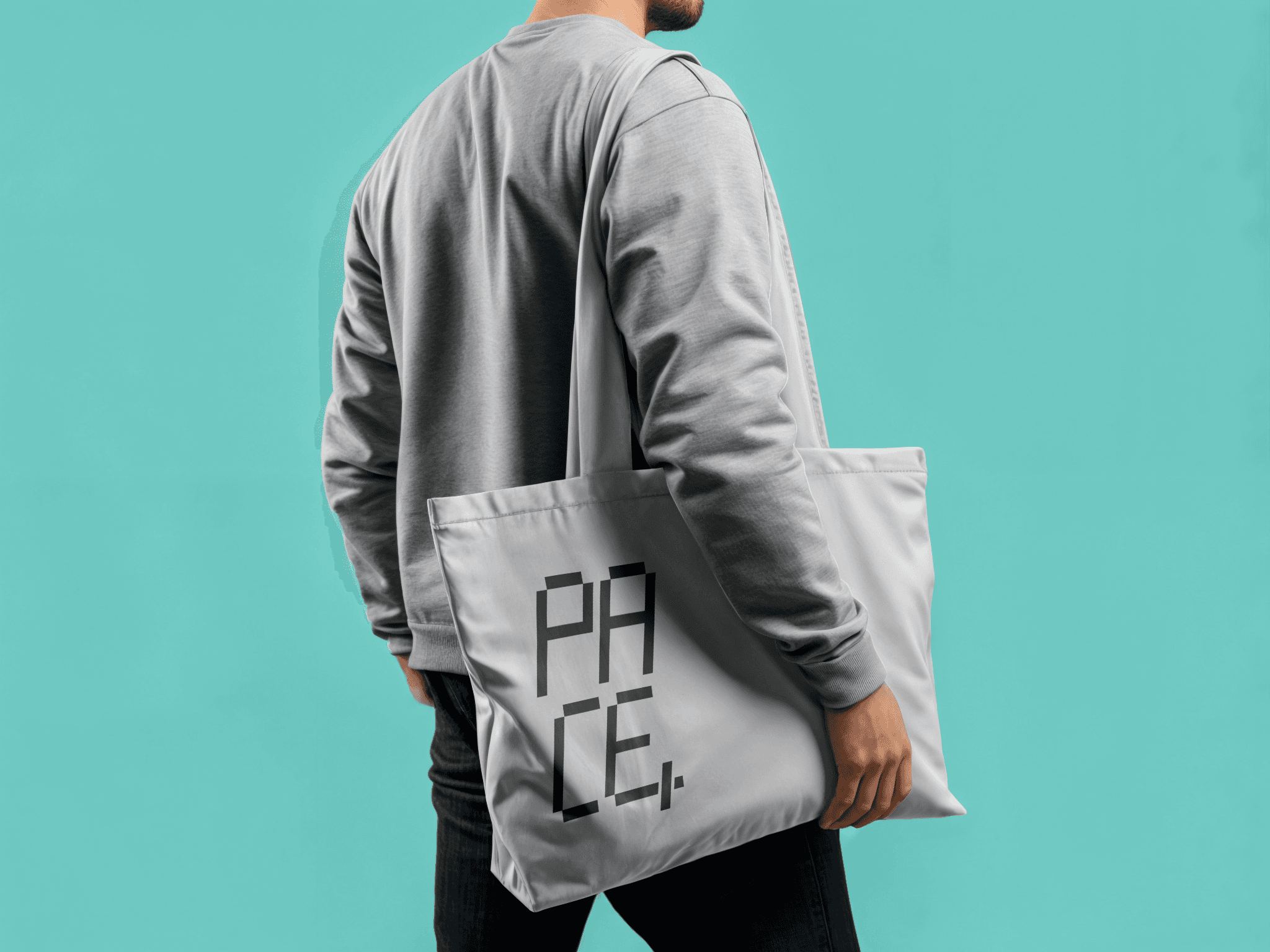
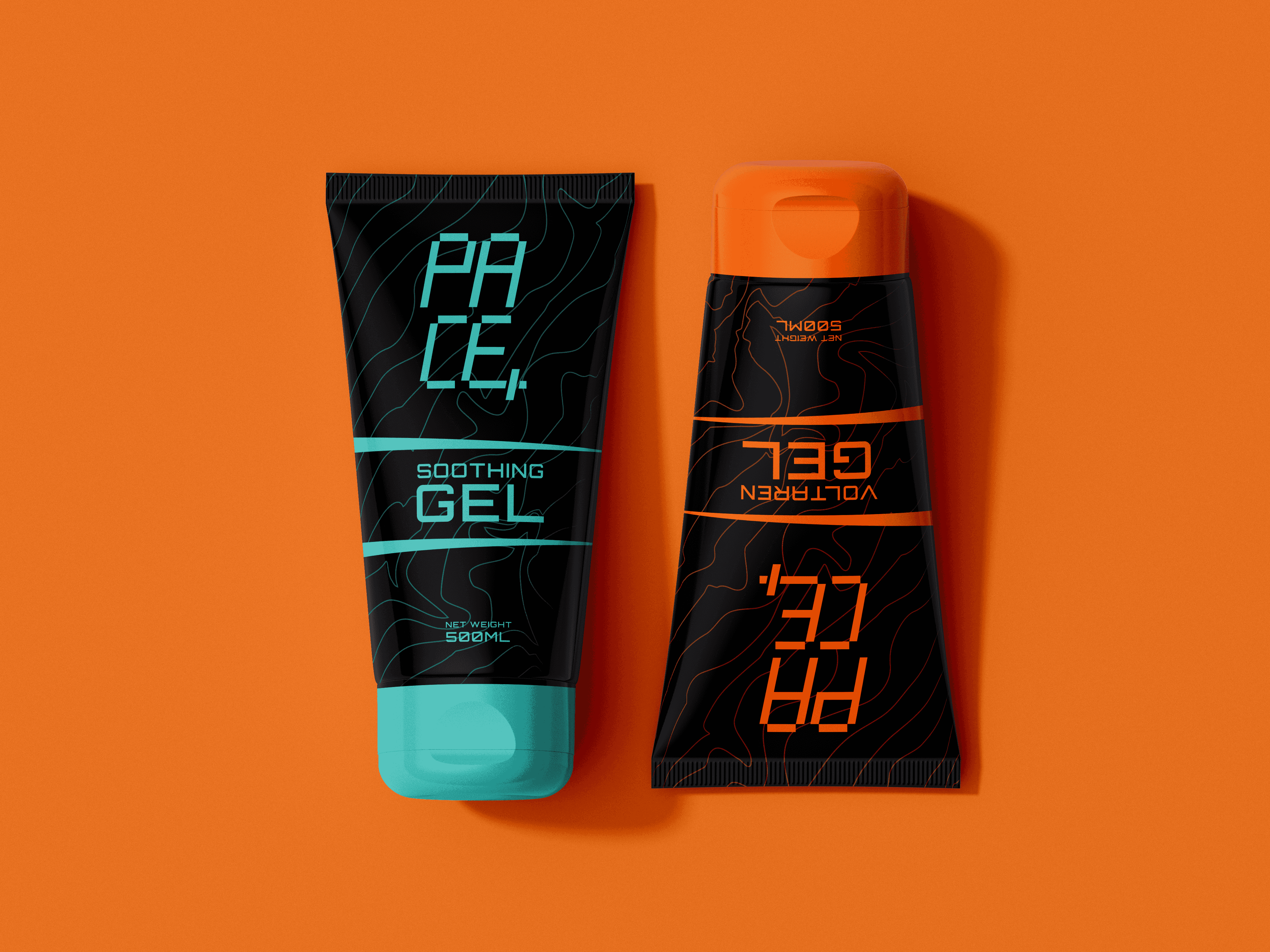
Pace+ stands out with a bold, performance-driven identity tailored for athletes. The custom typography is built from clean, rectangular forms—directly inspired by digital stopwatch numerals—capturing the essence of speed, precision, and endurance. Every visual element echoes the language of motion and intensity, making the brand feel energetic, modern, and unmistakably athletic.
What’s included in this identity:
– Custom-designed logo with unique athletic typography
– Full packaging design tailored for performance skincare
– Branded visual assets for advertisements and digital campaigns
– Poster design with high-impact layout
– Bold and cohesive visual direction across all elements