


In todays competitive world, your product is no different than the product on the side of the shelf. No matter how much quality it provides or benefits it has, it easily blends in the competition unless differentiated on the level of brand and branding. so how it actually works? let's see with an example of a rebrand project.
Grade - Sports merch
Grade is a sports merch store specializing in volleyball fan merchandise. The brand aims to feel sporty yet approachable to volleyball enthusiasts wherever they are. Even when they’re alone, they don’t need a crowd because they belong to a like-minded Grade community where they can shine and enjoy the sport. The problem was that despite having a strong vision and USP, the brand was unable to build a community that truly felt like them. As a result, they couldn’t reach the revenue targets they once envisioned.
What went wrong?
The brand had a clear vision and purpose, but it wasn’t connecting with its audience because the message wasn’t being understood. Grade struggled to build an identity that could consistently communicate its values across multiple touchpoints. At this stage, the brand already had a logo, a colour palette, and visual assets. This is often where brands lose significant sales.
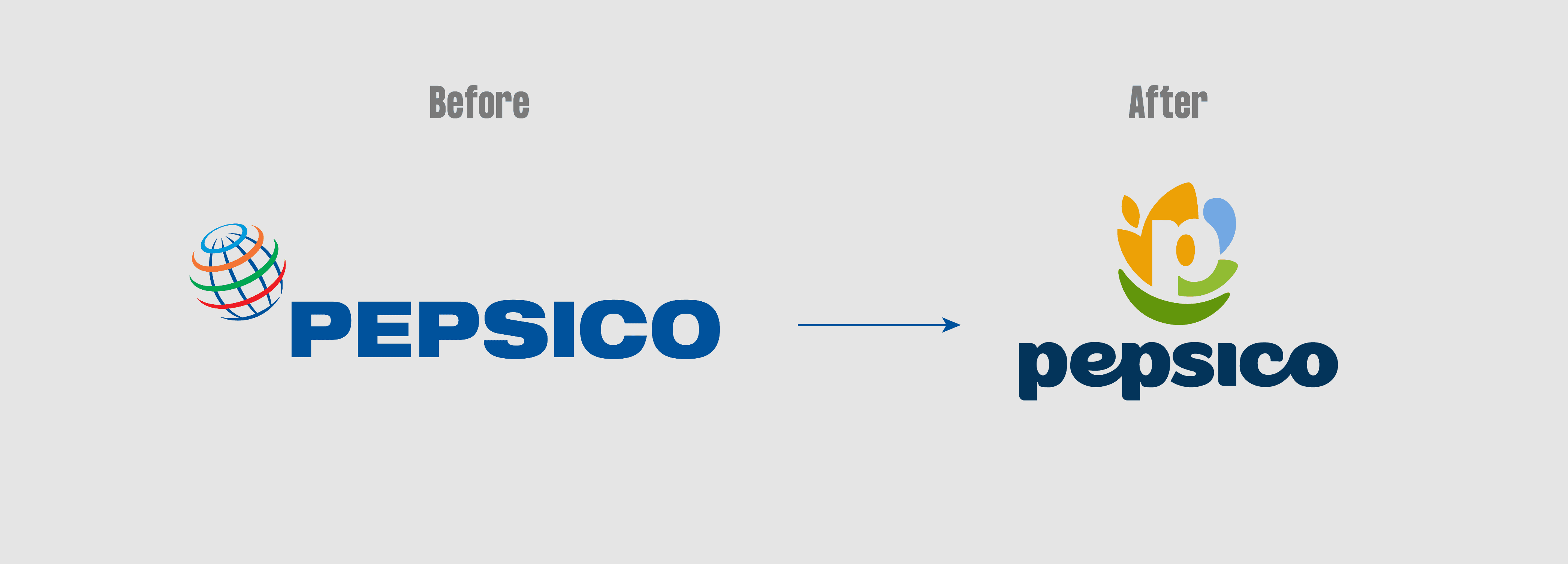
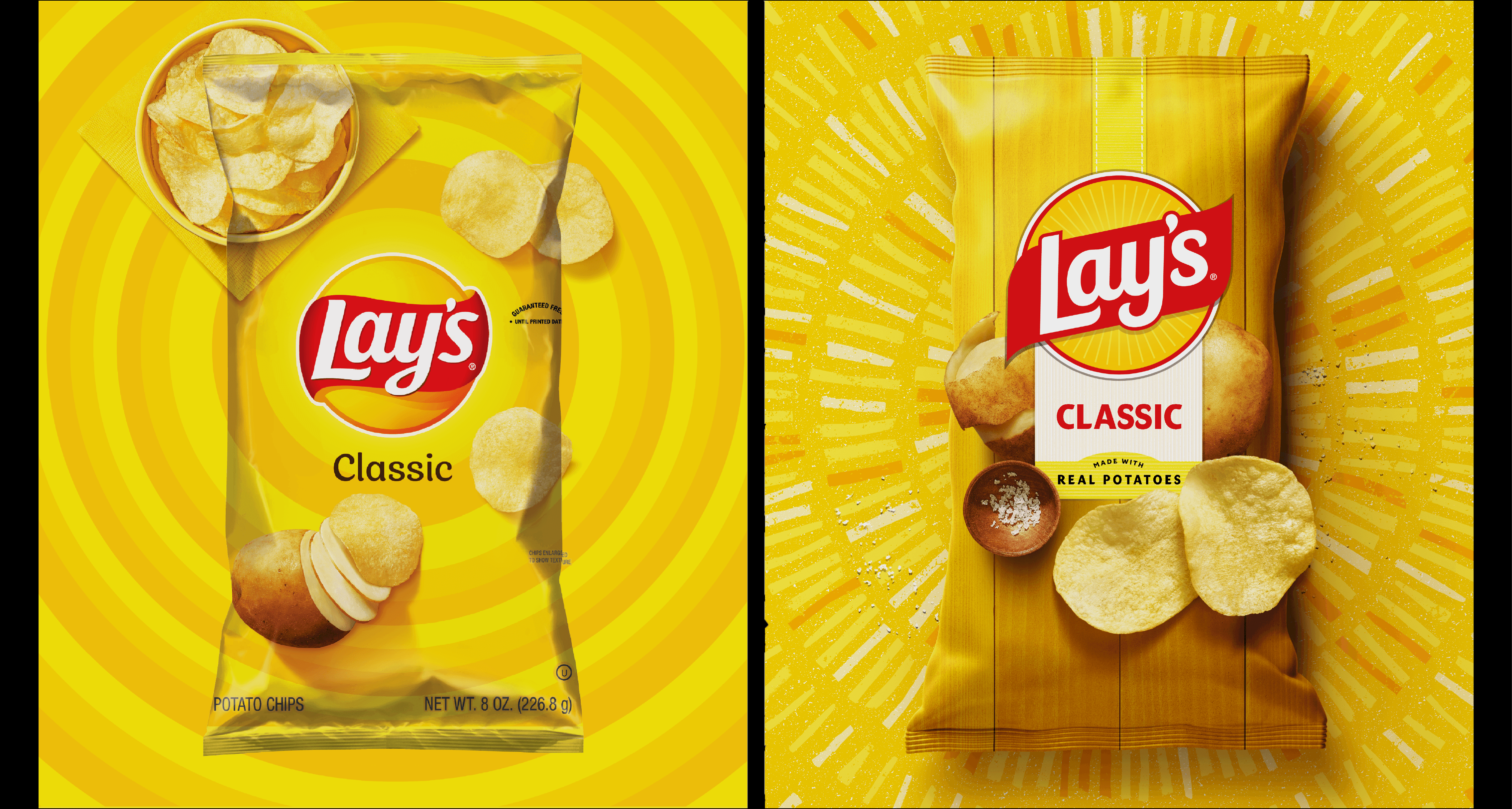
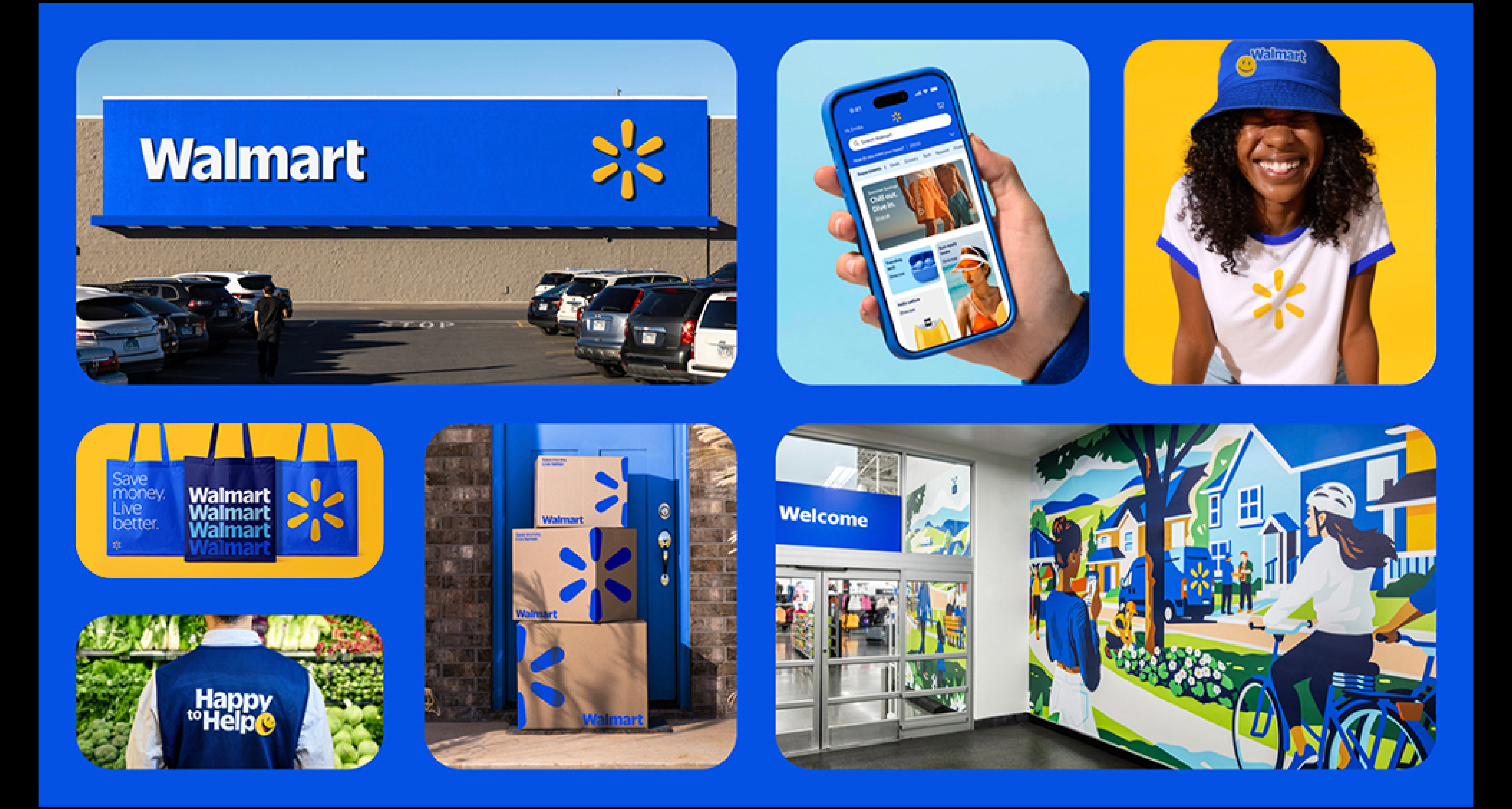
A brand is not just about visuals such as logos, colours, images, or even the product itself. It’s about the experience customers associate with the brand when they think about it. A brand is an intangible asset, a reputation built over time. Many well-known brands around the world have gone through rebranding to realign with their audience. For example:
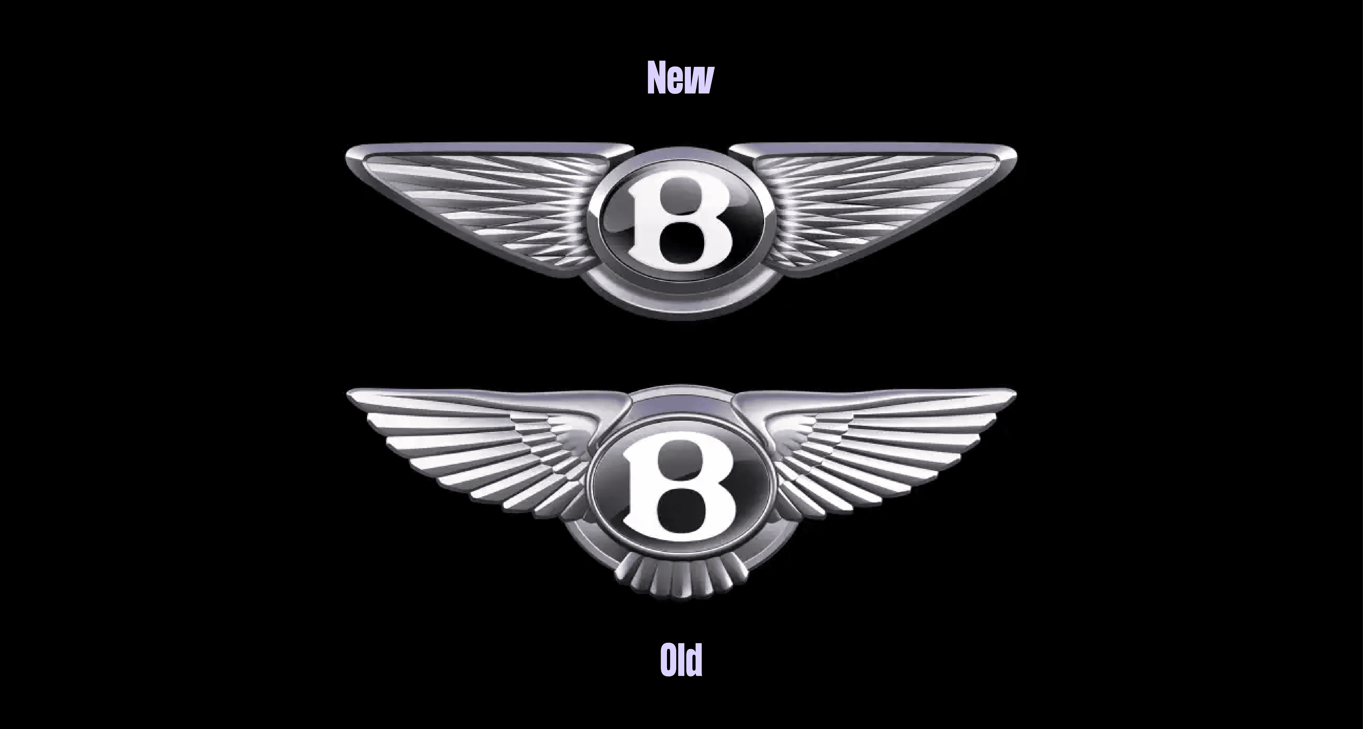
And the list goes on..
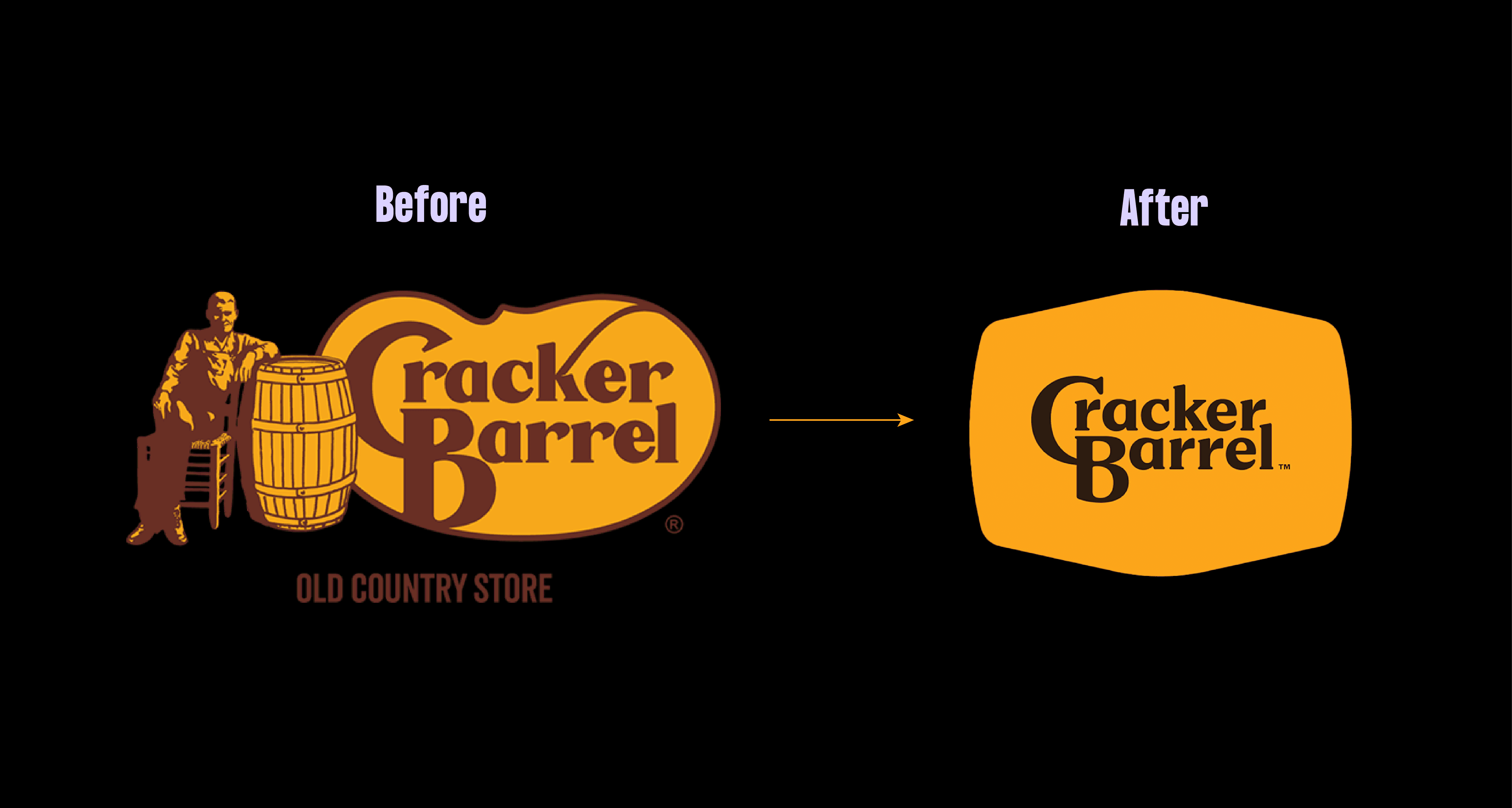
These rebrands directly affected brand positioning. Not all of them were successful. Take Cracker Barrel, for example. By following a minimal design trend, the brand lost its original message, which reportedly led to nearly $100M in stock value loss. Cracker Barrel was built on old-country charm and nostalgia, but when it shifted toward a clean, modern identity, its loyal customers didn’t connect with it. Even Gen Z, the audience it aimed to attract, rejected the change.
The takeaway is simple. A brand does not need to abandon its core values every time it tries to reach a new audience. Often, staying true to those values and expressing them more authentically builds stronger belief and connection. This is why brand positioning matters. In the long run, a business is not sustained by profit alone, but by customer trust and retention.
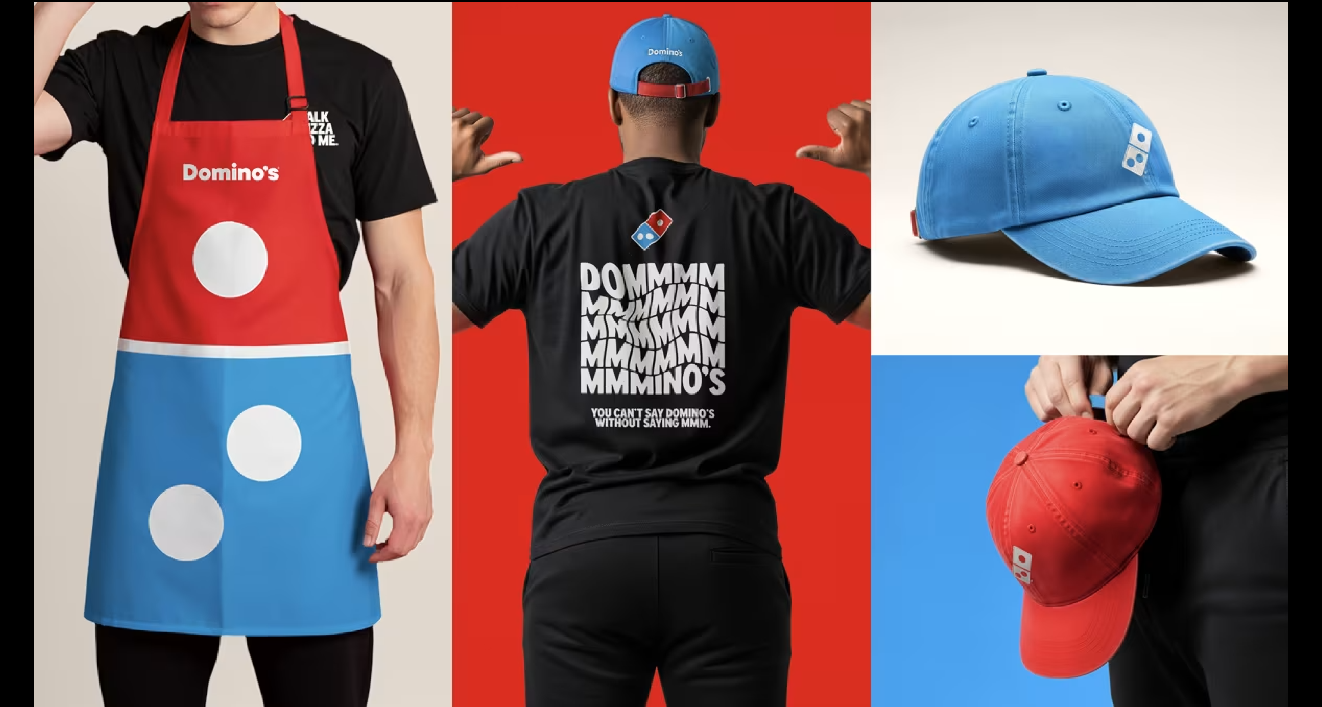
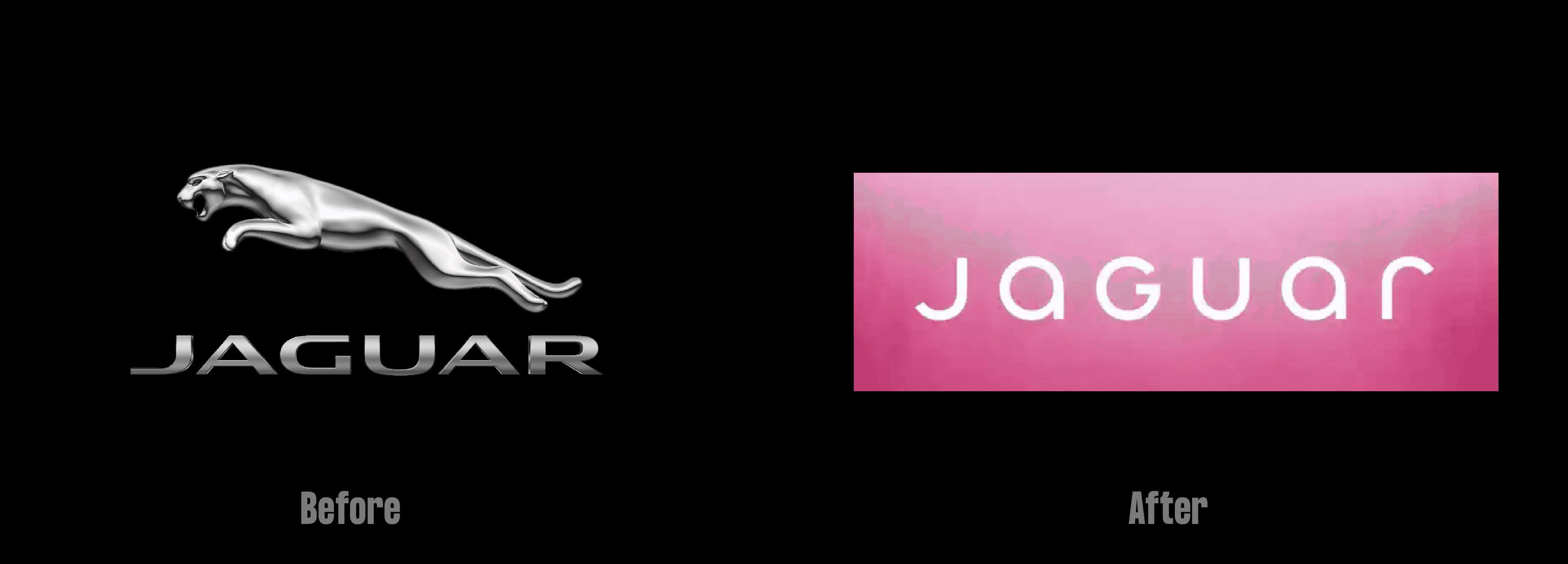
A similar setback can be seen with Jaguar, which drastically changed its positioning to align with the electric car industry. In contrast, brands like Domino’s successfully rebranded by improving their image while staying true to what made them recognizable.
Learning from these real-world rebranding cases, we set out to create something meaningful for Grade.
How we rebranded Grade
Grade’s previous identity felt dull and rough, which didn’t reflect a bold, confident, community-driven sports brand. We created a visual system where Grade feels like a supportive friend to sports enthusiasts, keeping the spirit of sport alive in a technology-focused world where physical activity is slowly fading.
Multiple logo variations were developed for use across merchandise and stickers, making the brand scalable and consistent across all touchpoints. The iconic volleyball mark honors the sport where Grade first began building its identity.
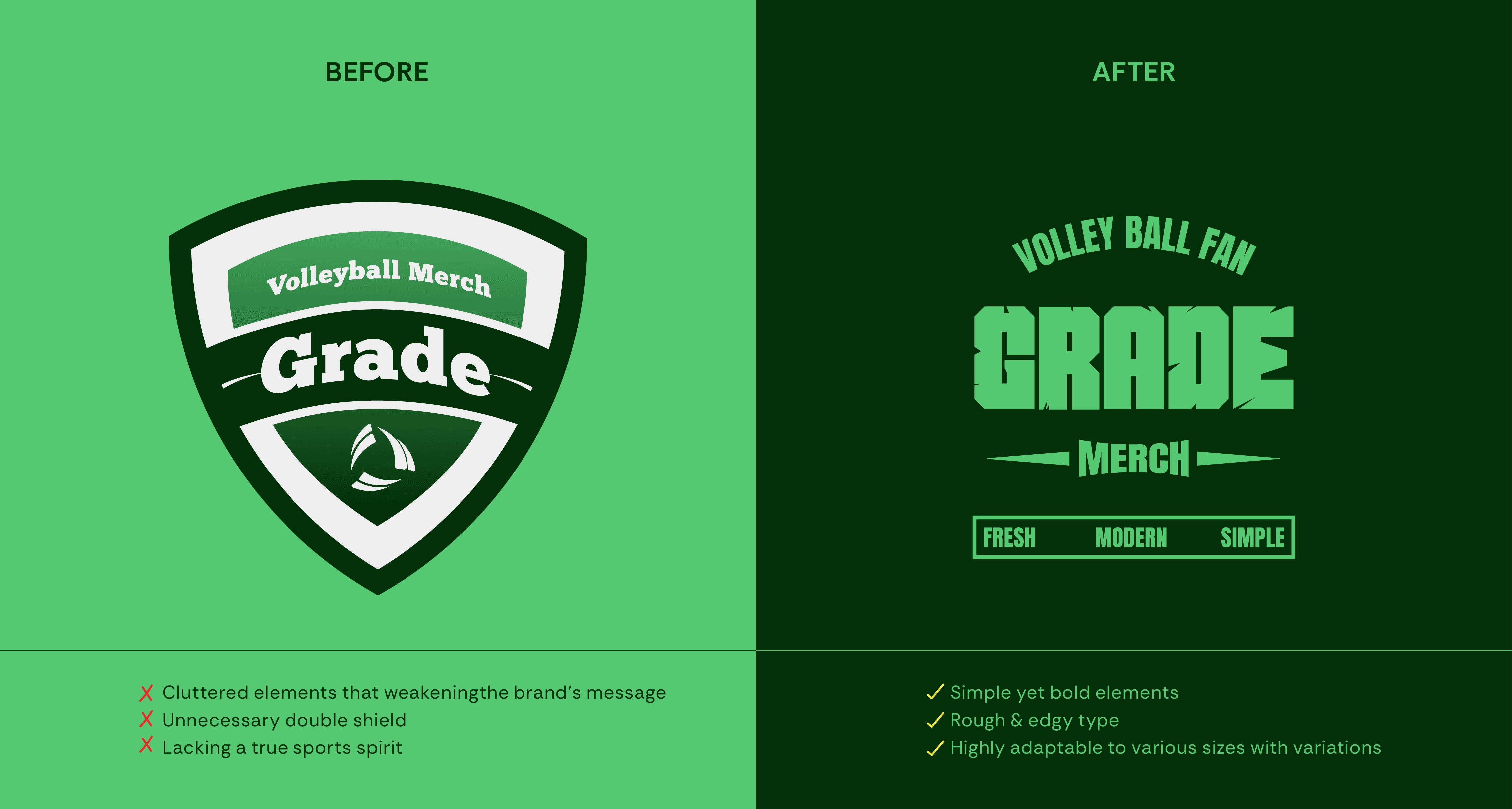
The logo was an emblem placed inside a shield, intended to symbolize bravery, but it felt cluttered. The mark leaned heavily toward sustainability, reading more as recyclable than sporty, which diluted the bold energy expected from a sports brand.
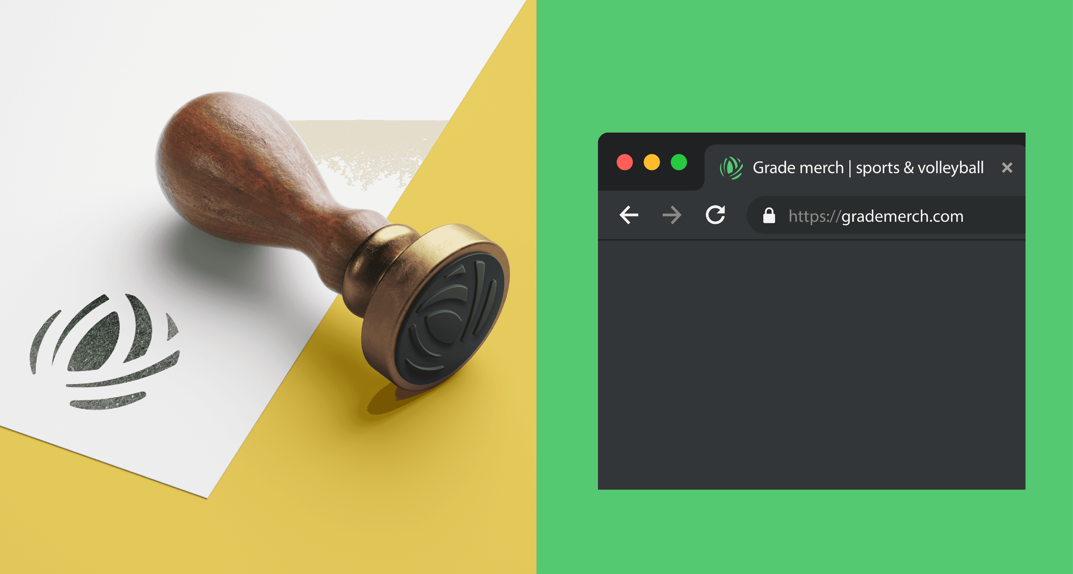
We developed a volleyball mark that subtly represents the game without being overly obvious. Its simplicity allows it to scale effortlessly across merchandise and digital platforms, making the brand instantly recognizable while still feeling confident.
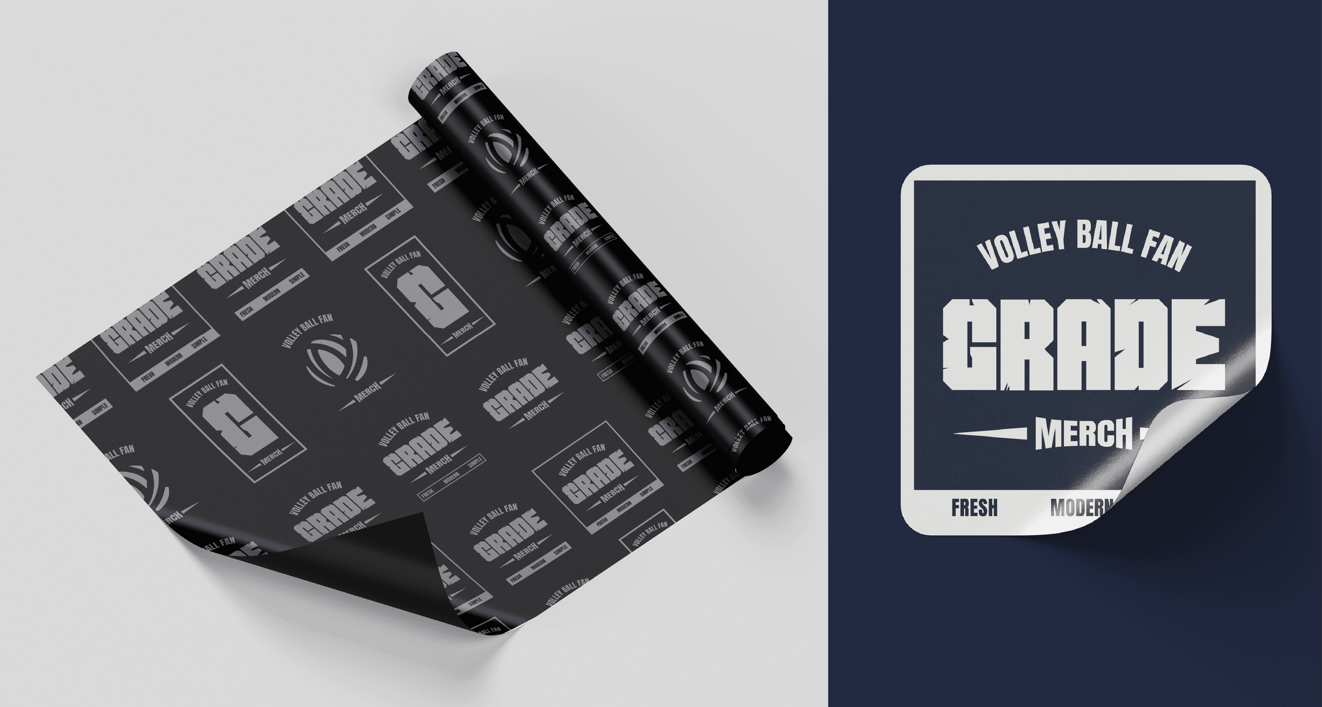
The logo suite contains multiple logo variations that are used across merchandise, packaging, and stickers. This strengthens the brand’s presence, from caps to mobile covers, and connects like-minded people who share the values of sports spirit and community. When a brand’s vision is expressed this clearly, a rebrand has the power to support long-term growth and stronger customer connection.

